Eye-cancer
Posted by in Tech at 4:29 p.m. on March 10th, 20062 Comments 0 Pings
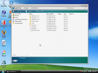
Microsoft has been busy the past few months. They’ve obviously spent thousands of man-hours working on the next version of Windows, Vista, in order to make it the gaudiest user experience possible.
Ugh, just look at that thing. I always thought the Playskool-inspired appearance of Windows XP was a horrible idea, but Microsoft’s focus groups apparently think otherwise. And they’re still shipping that ugly-ass, over-saturated landscape background, albeit from a different vantage point. It always reminds me of a close-up of Shrek’s scrotum, for some reason. Luckily, I’m not Microsoft’s target customer, seeing as I spend more time tossing Steve Jobs’ salad than thinking about upgrading Windows. Which is probably why I still use Windows 2000*.
For incorrigible updaters, there’s also a new version of Office coming out early next year, with a re-“thought” user interface. Windows applications in general, and Microsoft products in particular, have suffered interface creep since Windows 3.0 came out. That’s the first version of the environment that included the toolbar widgets, unless I’m not mistaken. I remember opening up Samna’s Ami, the first truly graphical word processor for Windows, and gasping with delight at the little buttons that bolded or underlined text with the click of a mouse. Such decadence, especially when coming off of WordStar.
Slowly, though, those little icons became the baffling swarm of obscure symbology we’re all confronted with every day. The Office 2007 toolbar in this screenshot, for example, takes up one sixth of the overall screen real estate. That’s a pretty big waste of pixels, but it’s nothing new for Microsoft. The default install of Microsoft Word 2000, for example, has at least 40 toolbar buttons on it, and came out at a time when SVGA (800x600 in Windows-speak) was still mostly for power users. There’s a button for Print Preview, which really should be exclusively a menu item, and there’s one for Spell Check, even though it spell-checks on the fly. There are also icons for Cut, Copy & Paste, even though I’ve never actually seen anybody use them; who the hell does that with a mouse? There are also some baffling buttons, including a globe with a chain on it, which I have to assume is the “Enslave World” function that was so popular in Microsoft’s internal builds.
I never installed Office 2003 on my own computers: I refused. I still use Office 2000, because it’s the only legal copy that I have, for one. The other reason I still use it is that Office 97, which was the last good version, doesn’t include the Euro symbol. I got stuck using Excel 97 on a customer’s computer a few months ago, and it amazes me how good it really was. It loaded in a snap, it didn’t pepper you with suggestions or constructive criticism while you were trying to work, and the shortcut keys are right where I remembered them. Excel, up through the Office 2000 version and most definitely excluding Office XP and 2003, is the only Microsoft product that is worth a damn at doing what it is designed to do**. Being a smug Mac fanboy, I usually justify this by saying that Excel was originally designed for the Macintosh platform.
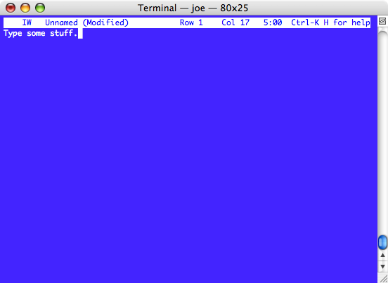
The main area where Office has really hurt the consumer is where it matters most: Overall productivity. In the end, the reason you buy an office suite is to help you run your office. That means document creation, management, and retrieval, as well as functional uses such as spreadsheets and databases. The first thing most users do when they sit down to create a document is not the creation of a document, per se. They muck around with the fonts, or try to figure out why certain words get underlined and turn blue, and where they can turn off that setting, or why they’re suddenly getting the third degree from some stupid little paper clip. What they most definitely do not do, is start typing. If you’re old enough, you’ll remember the Cadillac of word processors, WordPerfect 5.1 for DOS. When you started the program, there wasn’t anything you could do but start typing. I can’t get WordPerfect for DOS to run on my Mac, so here’s my WordPerfect 5.1 for DOS Simulator™, based on God’s Own Text Editor, Joe.

Clean as a whistle, visually, and lousy with vicious, finger-breaking keyboard shortcuts.
I’ve been supporting users since 1989, and to this day I have never seen a customer actually use Access to keep track of stuff. I would also estimate that the Office users I’ve supported who are actually proficient in Excel to be around 5%. Word is probably at the bottom of the heap, as far as used functionality goes. Very few of the documents I’ve seen are actually created with good word processing principles, such as structured style use, proper tabs and such. 90% of all word users could do everything they need to do with Wordpad, and save themselves a wad of cash in the process.
Probably the biggest omission in the evolution of the Office package is in document management. Users are still creating their own folder structures, naming conventions, and so forth, and nobody has any clue what they’re doing. Using the Windows filesystem to organize information is a recipe for pain and suffering. What users really need is iTunes for Documents. With iTunes, you don’t have to come up with some goofy folder hierarchy to organize your MP3s; you never actually touch your files, you just search or browse their descriptions, genres, or what not. You also synchronize that with your iPod, and you always have it with you, without even really trying. Imagine if it were like that with all your documents, spreadsheets, emails, and presentations!
Somebody needs to get on this.
--
* - Actually, I upgraded to XP last week, seeing as EA decided that Battle for Middle-Earth II doesn’t run under Windows 2000. Dicks.
** - Well, I do have to admit that I’m impressed what people do with Microsoft Outlook when they use it properly.


zonker
March 11, 2006 at 5:55 p.m.:You totally lost me after the reference to "a close-up of Shrek's scrotum".