The Desktop Metaphor
Posted by in Tech at 2:10 a.m. on April 24th, 20060 Comments 0 Pings
I declared myself done with the desktop metaphor 10 years ago. It bores me, almost as much as the browser metaphor.
For my younger readers, let me explain. “Folders” are those bizarre little yellow things that are depicted next to the plus/minus sign in Windows Explorer. The whole “Folder” thing was invented 30 years ago, by a company called Xerox, to ease the transition from the paper-oriented office, which was at that time the dominant type, to that of the digital variety. They decided that normal office workers could never be expected to visualize the arrangement of bits of data on a hard drive in any meaningful way, so they figured they’d represent them with little pictures of “folders”. Folders were, at the time, the way people organized their pieces of “paper”, which is a sort of thin film made out of “tree”, upon which things used to get “typed”.
The “Folder/Document” metaphor has no meaning nowadays, of course. People born after 1980 will have no idea what a “folder” is used for in the real world. When confronted with such a beast, they’ll no doubt grope around for 7 or 8 manila folders, label them “To Sort,” “Unsorted”, and “Stuff”, then try to find a way to nest them, as users do. Nor will they have any conception of the “typewriter”, or why such fonts exist as American Typewriter, other than making films like Seven. So isn’t it time, at last, to ditch the 1970s metaphor that controls computers today? It broke down long ago.
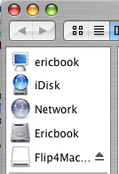
Hilariously, the Apple Macintosh, which is widely considered the ideal user experience, actually has a metaphor for the Computer inside the computer itself:

That first link, “ericbook”, is an icon on my computer representing, you guessed it, my computer. A recursive metaphor? The mind boggles. I realize that noone’s perfect. Windows 95+ also has a “My Computer” link, for example, presented, strangely, on the same logical level as the “My Documents” link.
“To xerox”, in my youth, was a synonym for “to copy.” 30 years later, it seems that everyone has forgotten what the original point of the whole thing was, and has settled on copying Xerox. Recursion, squared.
